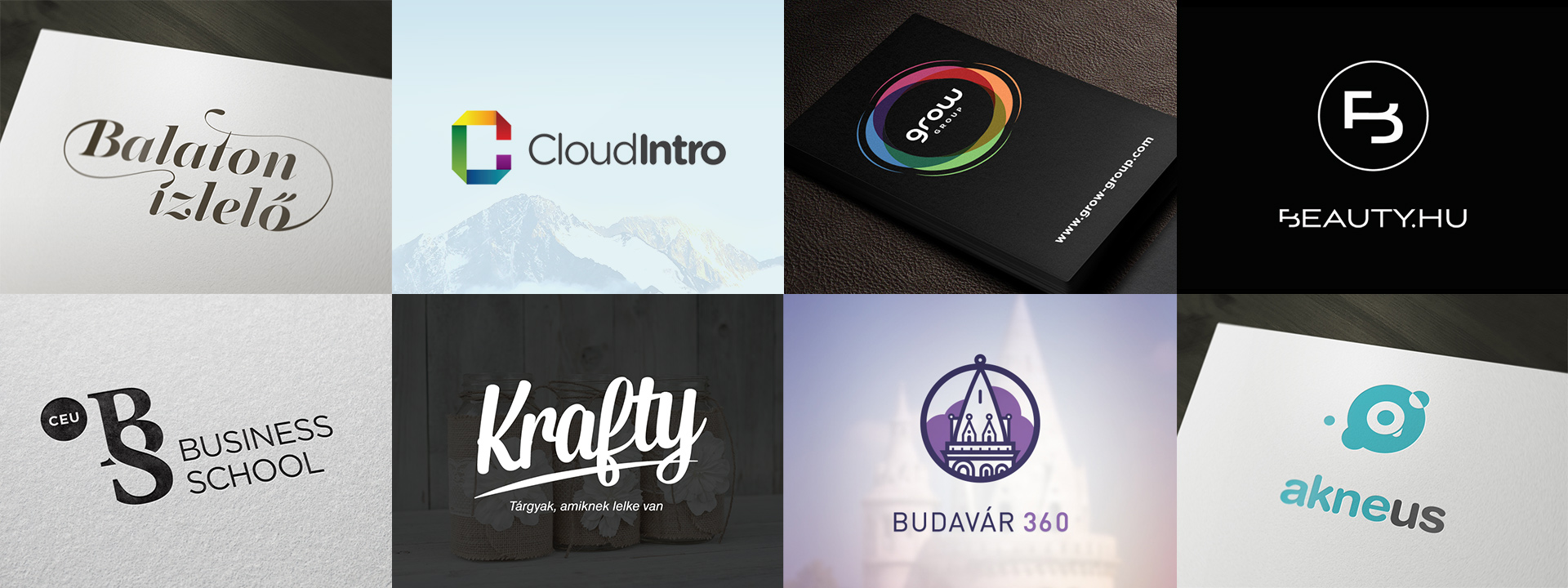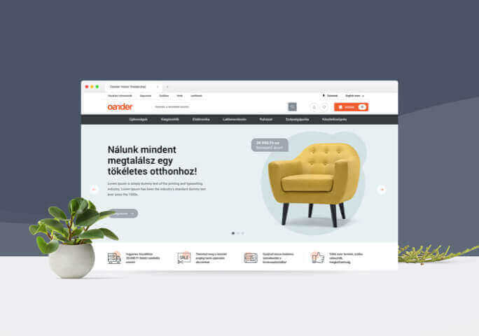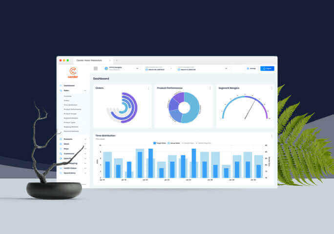
Designing a brand’s identity isn’t only a graphic task, it’s more about forecasting considerations and as a matter of fact, the future. As part of our collaborative work, our clients discover their tone of voice along the way of the process, they explore their roots and they revisit their brand values. This is where we come in and we translate all these findings into a unified visual representation. The right identity is not only visually pleasing and it not only suits the demands of the target audience, it’s also an innovative catalyst for all the products included in the project. It’s a framework that the project’s other graphic plans feed off of (webdesign, ergonomics, UI components, offline materials, ads and so forth). We aim for each identity and brand to have their own remarkable, consistent, understandable, honest and unique identity. Throughout our work we combine the strategic, developmental business thinking of a consultancy with the key learnings taken from the strategic methods of a design studio’s creative energies.
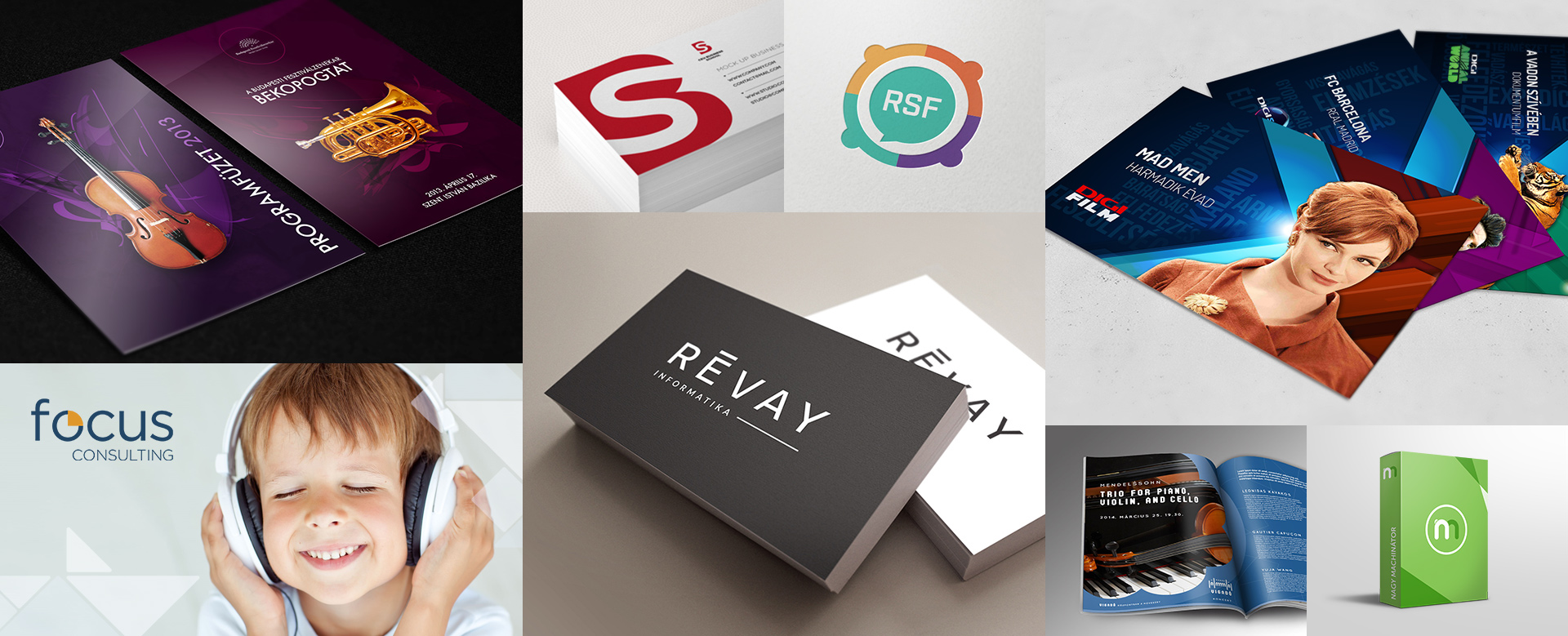
Our clients are after complex and ambitious challenges when it comes to branding, and the same goes for us as well. Branding and identity planning cover a wide spectrum. The main focus of our team is to create the digital landscape of brands, that stands the test of time on all platforms and devices. Our main field of expertise might be creating brand identities for web platforms, but we are also confident in designing offline tools and solutions too. Our team of talented graphics holds the title of creating and rebranding major companies, from small enterprises to big corporations.
How does identity design work?
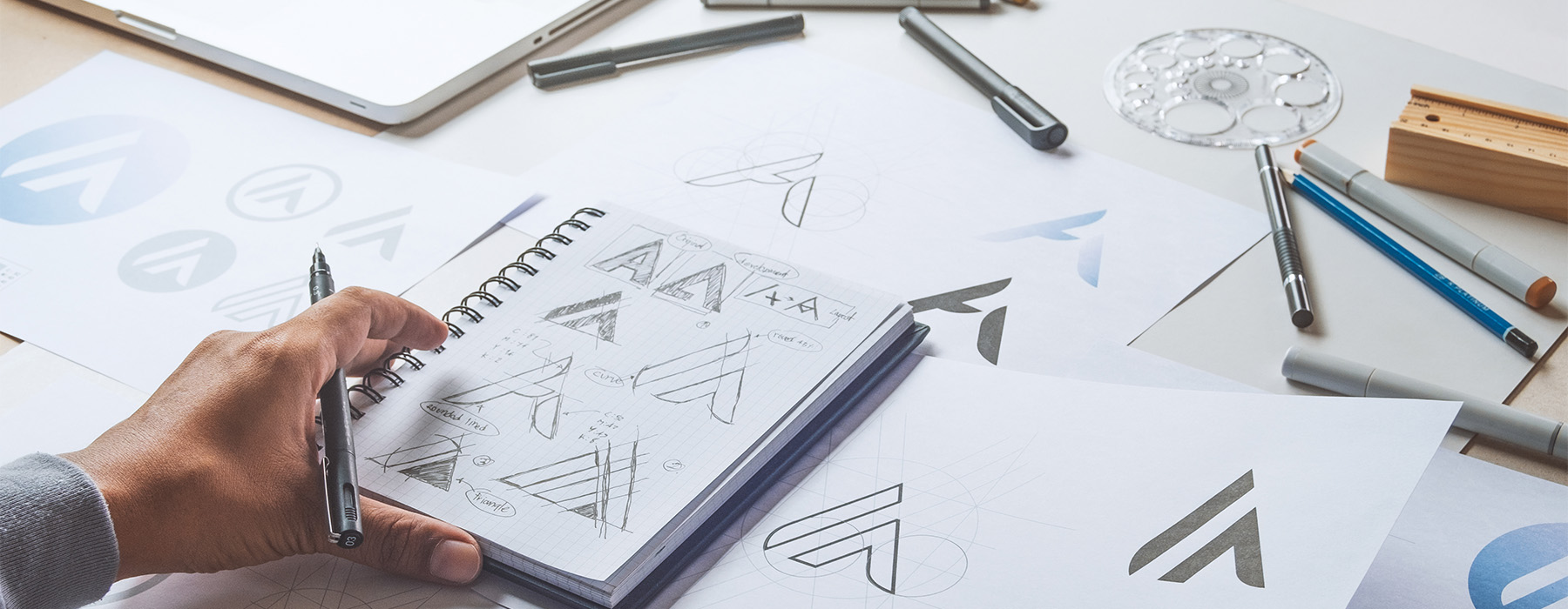
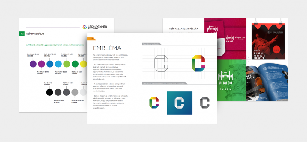
Identity designing always start with a brief: we defy the needs together with the client, we establish what we want to convey, we identify the visual representation and we target an audience together. In order to achieve this, workshopping is of the essence. We defy where the brand stands at the moment, we clarify the position of it, and we clarify what it wants to achieve in a few years’ time. The real graphic planning is often preceded by creating a mood board and a best practice during which we try to model the vibe of the brand by means of mashing up different visual references. Only after this do we start creating the first logo concepts and putting them in a key visual context. After finding and approving the right direction we start creating the user manual for brand identity, that supports creating and maintaining consistency in the future.
Creating an identity usually consists of the main elements detailed below:
- Creating logo alternatives for different end usage
- Typography and font sets
- Editing rules and bans
- Designing colour harmonies and defying colour codes
- Outdoor, offline creatives
- Establishing image treatment rules
- Creating usage and control functions for forms and figures (sample management)
- Ergonomic rules for user interfaces
- Preparing for iconography to be used
- Creating a professional user’s manual for identity
- Corporate identity (bio, folders, documents, presentation templates)
When’s rebranding necessary?
Creating a brand identity is an obvious first step for start-up projects with a ‘carte blanche’ but in many cases, this can be a necessary consideration for more established brands with existing identities too. Sometimes this only means a bit of finetuning and updating but in certain cases it might be best to just start from scratch. When being asked to redesign user experience, we start with strategic planning and with examining the current visual representation of the client’s brand. If necessary, we propose a full branding ‘facelift’. For us to decide whether this is necessary, we ask the following questions:
- Does the identity project a carefully considered strategy?
- Does the identity highlight the brand itself and does it set it apart from its competitors?
- Does the identity work for online, offline and for advertising purposes as well?
- Does it serve the business goals well and does it feel relevant for the customer?
- Is the identity timeless enough: would it still feel relevant in 5 to 10 years’ time?
- Does it offer a consistent user experience with its appearance, with its design and with the reoccurring features?
A few typical examples of features in the user manuals
If most of the answers to these questions is ’no’ then it’s best to start the collaboration straight away by thorough ergonomic and functionality planning. Design and identity can either spoil or elevate the mood of a digital product when it comes to the users’ first interaction with the brand, meaning that they really defy the whole of the user experience.
