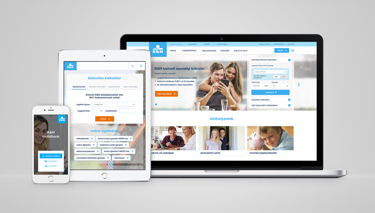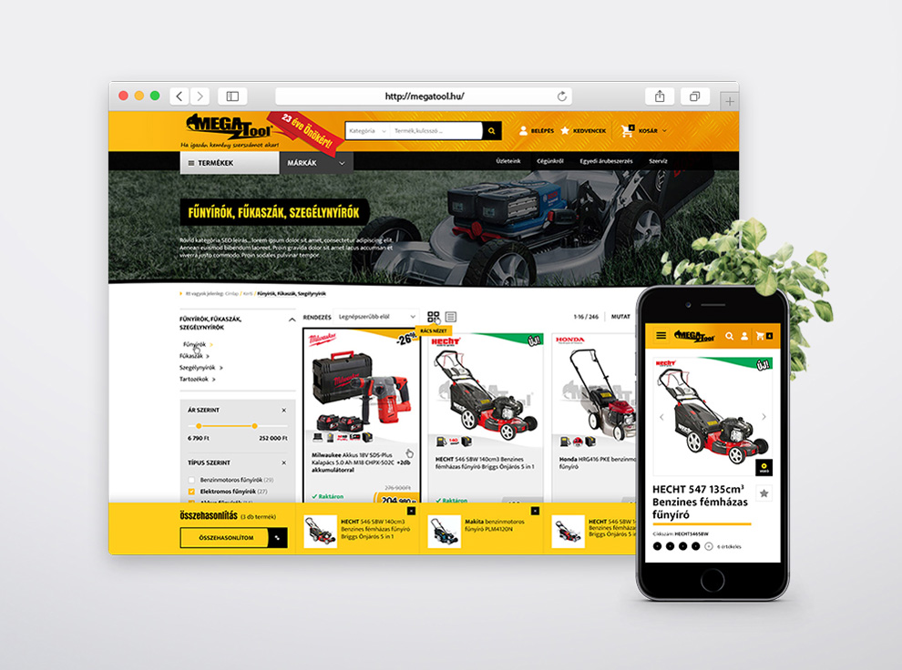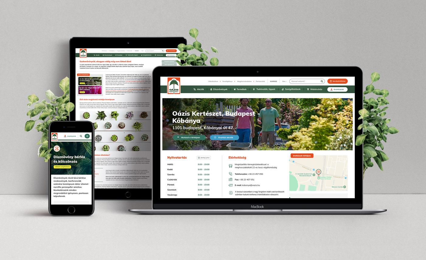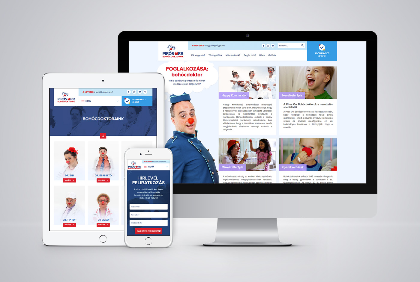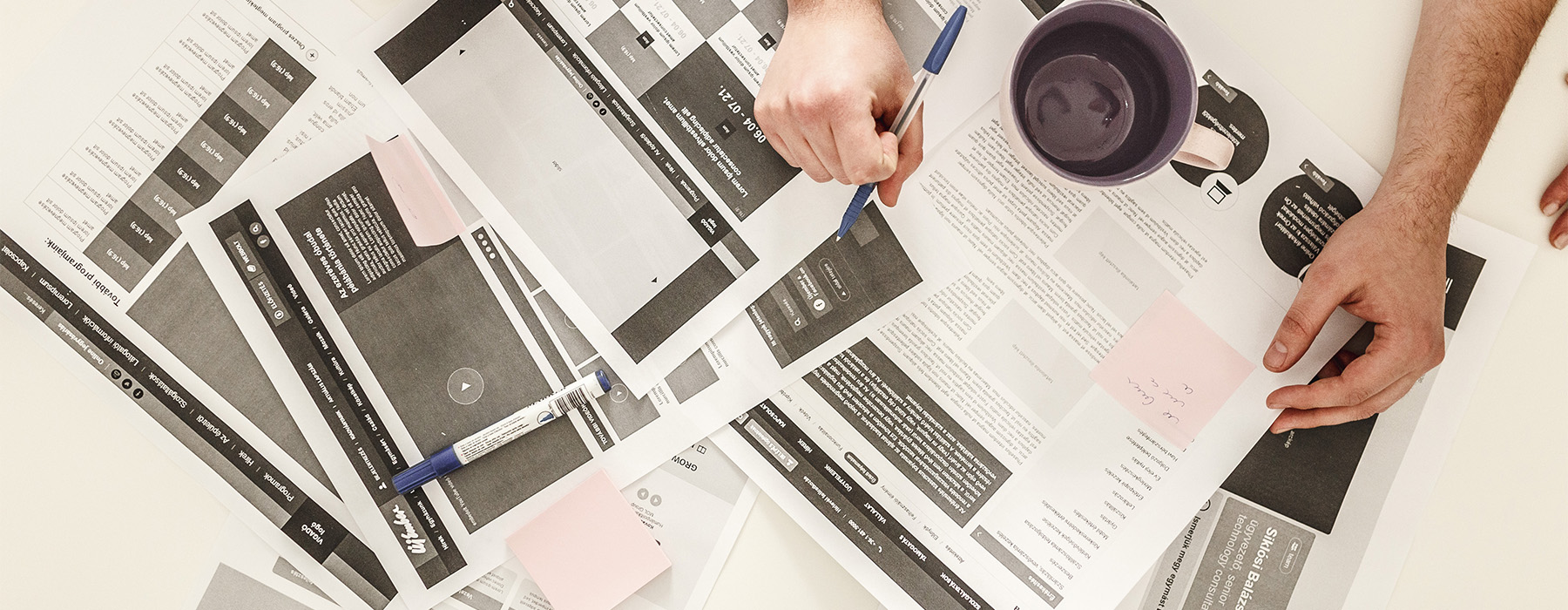
Digital assets should not only possess smart functionality but also great usability and aesthetic quality. The pursuit for exceptional user experience is our main drive and we also believe it can be an accelerator for growth. This philosophy has been the backbone of our work since our foundation. We take pride in carefully researching, conceptualizing and wireframing each and every one of our projects before opening up Sketch or Figma.
User journey and wireframe plans
Wireframes are essentially the blueprints of interfaces in the making. Starting to design a website without wireframes is like building a house without blueprints.
Planning a website never starts with the design of the user interface. Planning starts by identifying what visitors will be doing on the website, how they will behave, by identifying their actions, demands and by planning their journey click by click. How should a function’s user interface and its components be built? Do we need everything that we originally planned for the screen? In order to decide, we need the wireframes, that are the very initial visual representations of the user interface. We constantly strip things back to achieve a clean and functional result.
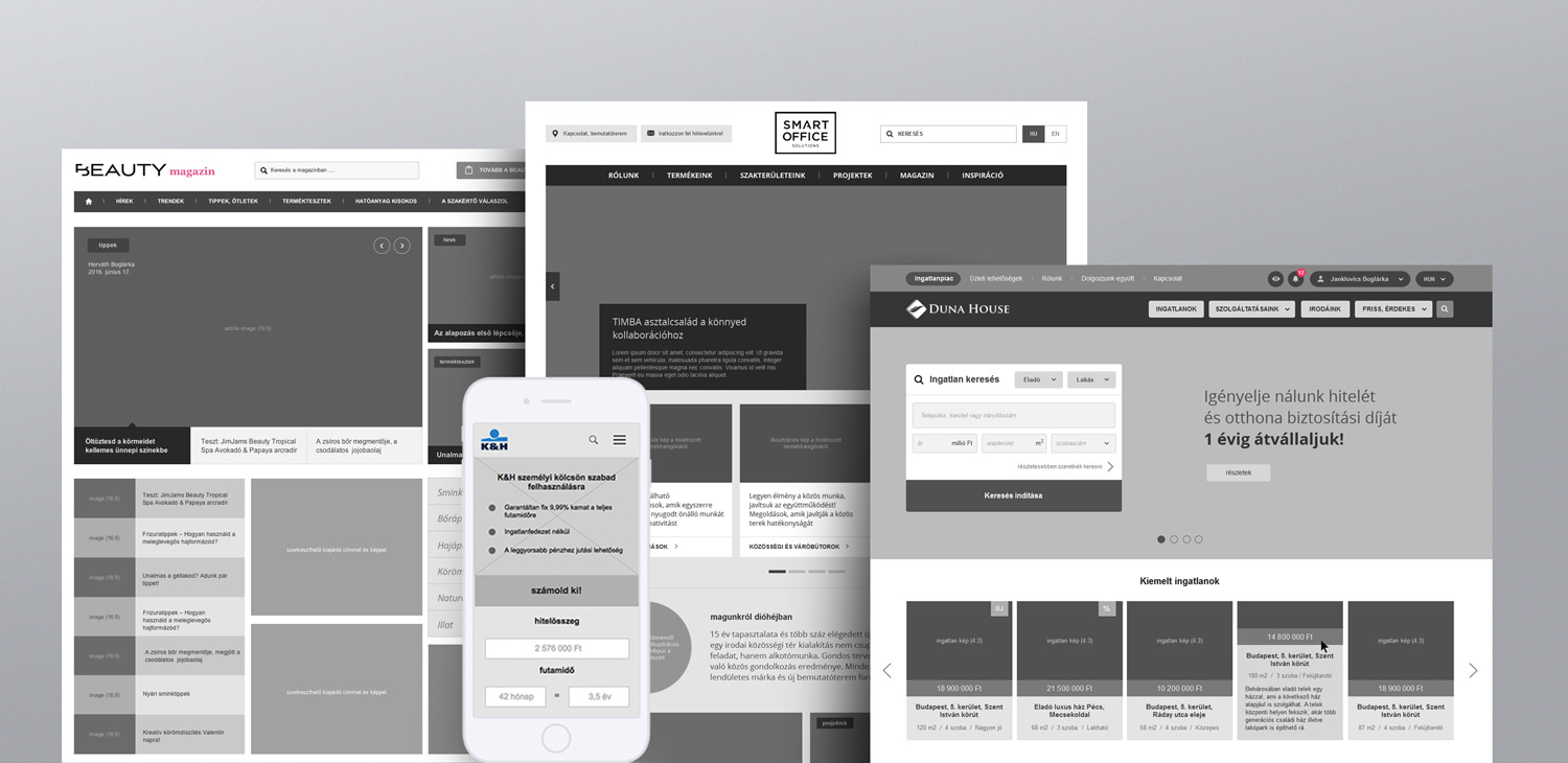
As we start to ‘unpack’ our high-quality sketches in the form of wireframes, plans start to become more elaborate and the user experience starts to surface. The main result of ergonomics planning is an extensive wireframe plan set, that covers all layouts and that will be brought to life with working functionalities, created by our designers and developers.
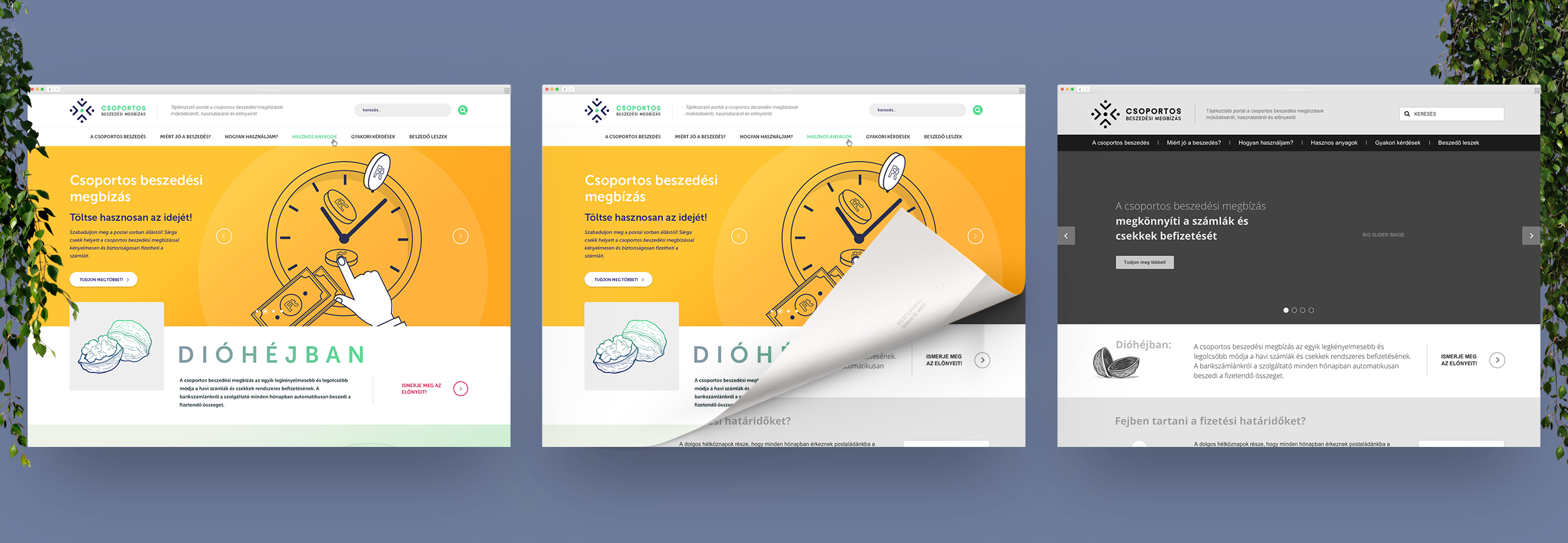
Why is wireframe design so important?
- Because it makes the project more cost-effective: wireframes are easy to put together, they can be modified quickly, and a lot of different layout variations can be tested on them instead of starting the project with time-consuming design developments straight away. With the help of wireframes, designing starts with a pre-approved site plan. This way, a lot of costly working hours spent on design amends and changes can be saved.
- Because it orientates the UI design: designers need to focus on creating art-level visuals, based on easily understandable wireframes rather than focusing business-oriented issues. If a designer bases their work on a wireframe, the client can be sure that the site build-up and the layout will follow the approved plans.
- Because it informs the developers during the planning process, allowing them to give feedback on whether functionalities, applications or services would work, and they can also estimate the cost of their implementation. This way we can avoid a trap situation, in which a designer creates something, that might not worth developing in the end or might not fit the project’s budget. This method also helps to eliminate the possibility of exceeding timeframe or financial limitations.
- Because it involves the client in the planning process: wireframes are not fully-realised design plans, but they are detailed enough for any client to be able to check and approve. The fast speed of wireframe planning allows the client to actively participate in the site planning, and during the process they will be able to learn everything about their site inside and out.
Our clients include

