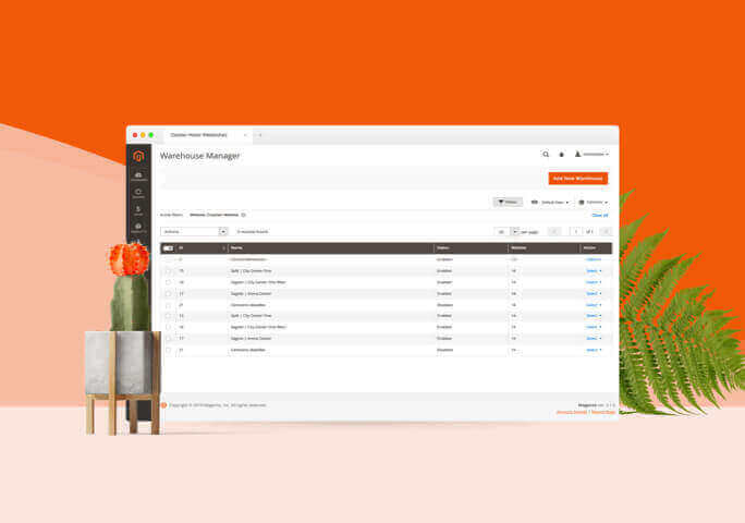
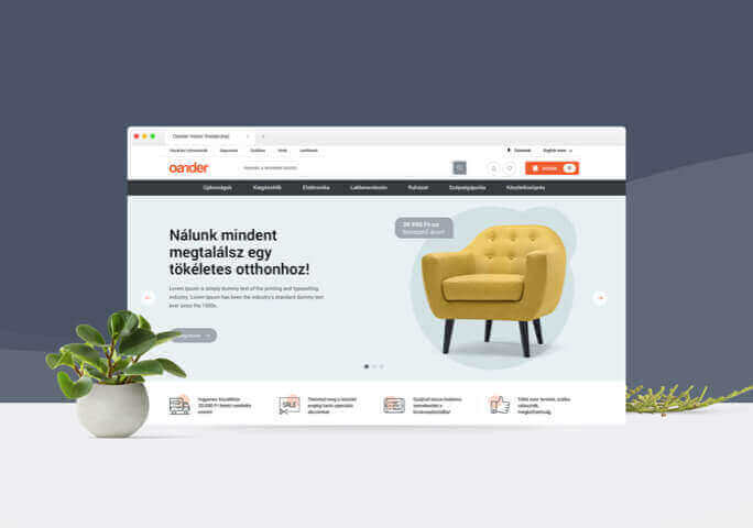
At the end of 2018 Magento’s latest stabilised version, Magento 2.3 became available, offering new functionalities for traders. Our team created a new base template for this version: the third main version of the Hodor template comes with a new design, a new user experience and better code optimisation. This new template is a result of usability research and careful ergonomic planning, seamlessly adapting to Magento’s latest functional updates. This case study shows why and how it was created.
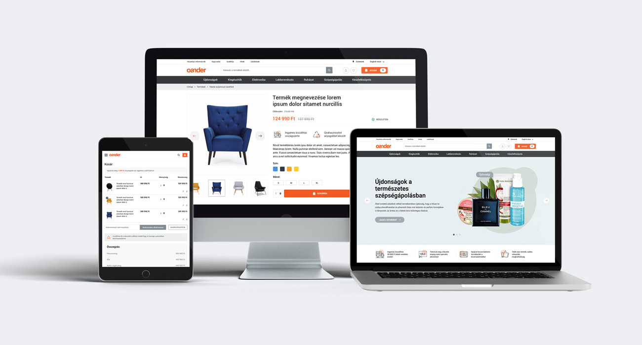
What’s a webshop template?
All Magento’s functions, modules and its ecommerce capabilities are useless until they appear on an understandable, user-friendly and proper frontend, or in other words, in the user’s browser. The frontend is what visitors interact with and this is where they make their purchases. In Magento’s case we call these templates.
The reason for this is because it’s essentially just a pattern that can be changed. The appearance of a Magento webshop can be updated or completely changed by modifying these templates, without having to get rid of the backend developments or the database. Templates are Magento’s essentials parts – they defy the user experience.
When launching a Magento webshop, no one creates project-specific templates from scratch, as it would be a task that would require thousands of working hours, given Magento’s functional complexity – it simply doesn’t worth the effort. As a general practice, each web development company would offer a ready-made solution for clients which is usually Magento’s own default template called Luma, that can be developed further based on individual needs. Magento, being the world’s leading PHP ecommerce software, offers a ready-made frontend interface with complete webshop functionality. We have been using this template for a long time when launching webshop developments, alongside similar default ones that Magento’s previous versions offered. We’ve used these as foundations, updated the default functionalities and customised the design, based on the client’s requirements… Up until five years ago, when we’ve decided that it’s time for us to develop something on our own.
This product was named Hodor. After its initial version we’ve made some further changes and in 2019 we’ve created the most up-to-date one, version 3. This version is a fully updated template which broke the ties with the old codebase: we started with a blank page and developed it specifically for Magento’s 2.3 version.
The reasons
You might wonder why we felt the need to create our own base template. We’ve got 4 reasons:
- First of all, Magento’s base template doesn’t incorporate the latest fronted technologies that we wanted to use in our projects. Taking matters to our own hands, we managed to add solutions to the frontend that were widespread within the industry but were missing from Magento’s default offering. We managed to incorporate a Bootstrap 4 framework, Gulp and Sass workflows, we prepared the important components to be able to fun on Vue.js and we managed to apply a mobile first approach. With these additions, the template became even more flexible and by applying and implementing them, the template can be customised further than what Magento 2’s base template would accommodate for.
- Secondly, Magento’s base template is great but it lacks a few things when it comes to ergonomics and design. Those, who had a chance to work with Magento before know, that it’s functionalities and it’s customisable nature makes it the world’s leading ecommerce engine for a reason. However, it’s a well-known fact that Magento’s default base template (Luma) is a bit too generic. In the past years, we’ve gathered a lot of experience in what ergonomic solutions and what kind of ‘tricks’ help to grow conversion in the market and in the region as well. We wanted to take these key learning and add them in to our future projects and we also wanted to fix some of the defects of Magento’s base template. This was a call for us to create a template from scratch. By developing OANDER’s own template, we can now offer a complete solution to our clients, that’s based on tested and proven UX and SEO best practices, instead of having to develop something new for every single project with Magento’s base template.
- Thirdly, the Hodor template helps to implement new modules easily. OANDER owns a lot of self-developed Magento modules, and by lot we mean hundreds. In order for us to be able to add these in to our client’s webshops easily, it made sense for us to build our fronted around the same base template, meaning that our module-level products all belong to one single ergonomic structure.
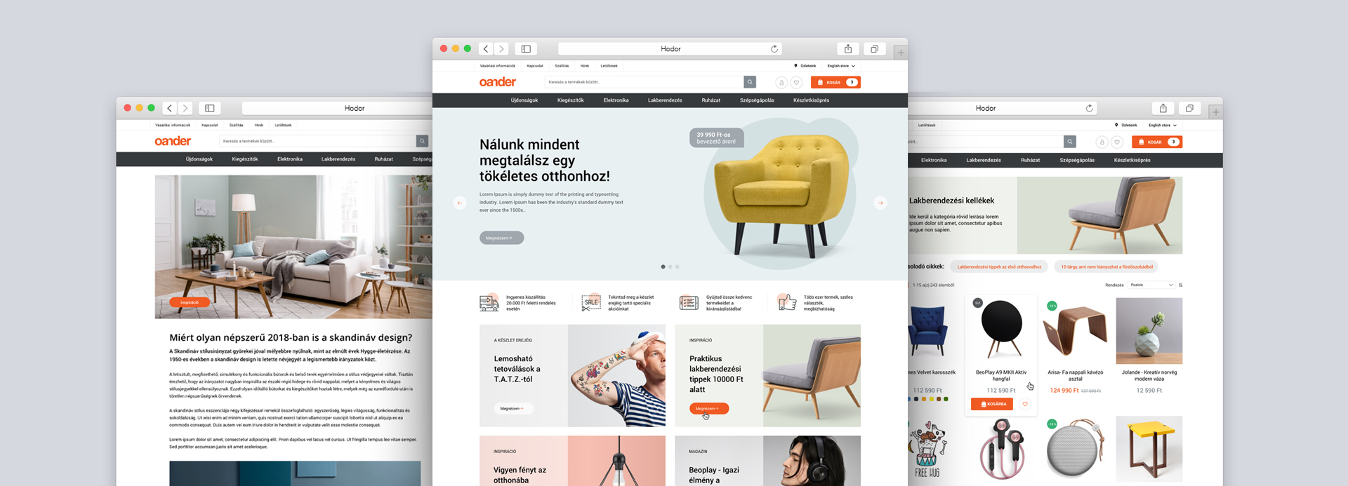
- Last but not least, our aim with the Hodor template was to offer a standalone, fully-rounded product that can work as a functioning Magento webshop frontend interface on its own, without any adjustments and that is approved and appreciated by our clients. The same can’t be said about Magento’s default template, Luma. Luma always needed a few updates here and there – for example in order to qualify for local legal regulations. Hodor on the other hand is a complete webshop design suited for the local region, that can be launched immediately with a few colour adjustments or branding updates but essentially without any additional frontend development.
Preparation: research and analysis
The development of the Hodor template started with a best practice and ergonomics/functionalities research. We are in a privileged situation in which we work with, we maintain, and we develop several high-traffic websites, many being leaders within their respective fields, meaning that we had the base for our research. In this phase we analysed the heatmap data and the traffic of these sites and we reviewed conversion optimisation developments to see which ones worked best. In a relatively short period of time we managed to pinpoint which functions and ergonomic solutions work across the board and which ones should be incorporated in the new template.
UX and UI design
Developing the webshop template’s interfaces, we applied OANDER’s wireframe-based ergonomic planning methodology, meaning that the buildup logics were modelled with wireframes first, ahead of the design development itself. During the planning, we had to pay attention to Magento’s functional abilities so that we don’t limit the usability of the feature set offered by the system. Instead we wanted to support it with our own added solutions. Ergonomic planning was based on constant feedbacking between Oander’s teams who were working on this project.
Once finished, came UI design, a task that was required some serious design planning, given the volume of the project. This phase included 40 screens per view, adding up to a total of 200 design screen wireframes and design developments if we add widescreen, desktop, tablet and mobile views.

For the UX and UI design we used Sketch instead of Adobe Photoshop. The reason for this was not only that the output file sizes were smaller this way, but also the fact that Sketch’s user interface was designed specifically for UI design, and it’s symbol system supports the use of the atomic design approach that builds on reoccurring components.
Since creating the first version of Hodor our goal was to create a template that can easily be modified, based on project-specific requirements and that can be handed over as a fully-functioning Magento webshop frontend with minimal branding investments. To support this, we’ve created a master style guide and a symbol system during the development process that ensure that UI planning of webshops based on this template, additional updates or potential future developments are easier.

Developing the template, preparing the modules
As the template was created for a new Magento version, the development came with quite a few backend-compatibility tasks. The function packages were grouped, based on site types and planning guidelines and we defined which one of our existing modules need to be adjusted to Magento’s latest 2.3 version. At the very beginning of the planning phase, we had the backend and module-developing backlog ready, featuring all tasks needed to be performed for the new base template. This meant that the backend development could start alongside the design development of the template.
When planning the technical background of the template, we made a conscious decision not to use Luma as a simple child template: we wanted to start from zero with Hodor. This way we could override a lot of Magento’s limitations. The timing to launch or Hodor 3 project was fortunate in a technical sense: we started the project when Bootstrap 4 was released so we could feature the latest and most modern responsive frontend frameworks under the template’s umbrella.

Both the planning and the development was carried out in an agile way and our team utilised the Scrum methodology for the project. This meant that we didn’t defy the technical background of the project in advance, we were focusing on new solutions and demands that came up along the way instead. This way, we could incorporate new ideas when developing Hodor 3 and with the function packages delivered at the end of prints and the quick release cycles, internal testing was also easier.
As it happens organically in case of each software development, the expectations towards Hodor 3’s end product changed as well along the way: we decided not to go forward with ideas that we initially thought were important, we incorporated new ones instead and we were also experimenting. The template is now available in a stable version and we use it for live projects but essentially the development process is still ongoing, the template is never fully finished. Once we complete a universal Magento module, we immediately add them in to the template. This only works when an agile development methodology is applied.
In summery
Creating the main version of Hodor 3 was a multidisciplinary project that involved each Oander team. Business analysts and experts created the concept, working in close collaboration with other teams while constantly monitoring the development of the product. The template required in-depth UX and UI design research and a lot of backend development was needed both for creating new modules and making existing ones compatible. Our QA testing team was overseeing the development as well, making sure that issues uncovered during the development of the template will not make it to the final version. The most resource-demanding part of the project was the frontend development of course, as the whole aim was to create a webshop template.
The whole process took 5 months to complete, expanding over four thousand working hours. Hodor’s third template version was in a marketable, fully tested and finalised state by the end of March 2019. Since then it has been constantly evolving based on the experience and feedback. Our ultimate goal with this product is no less, than to take the world’s leading ecommerce software to the next level with a template that’s optimised by the most modern technology, research and analysis.
