The Client
For those, who follow the Hungarian scene of applied arts and for those who are interested in hand-crafted design, Panyi Zsuzsi’s name will sound familiar. She’s a devoted fan of glassware, an artform she turns into creative pieces of jewellery and refined design accessories. Her works are characterised by unique craftsmanship, bold and vivid colours and simple, geometric shapes.
The story of Panyi Zsuzsi is a perfect example of how a passionate hobby can turn into a successful business. It also shows how a carefully planned and considered ecommerce presence can bring a turning point to a business’ life. Her company invested in modernisation and innovation in the past couple of years. In 2016, we were honoured to have a chance to create her brand’s new webshop on a Magento 2 platform.

The challenge
The business operations and the webshop management of Panyi Zsuzsi’s brand are something that corporate companies should be in awe of. With its communication, the brand builds strongly on its own content marketing, social media, targeted remarketing, seasonal offers and on precisely executed eDM campaigns, based on shopping trends and individual offers. The customers can benefit from loyalty programmes, personalised offers and special promotions, suited to the target audience they belong to. Serving customer needs and logistics are in synch with the manufacturing process: every step along the way is carefully scheduled. To achieve this, several end software have to be perfectly aligned.
These complicated business processes are not just added elements of the webshop’s operations, these are the building blocks that defy and aggregate the shopping information and the customer behaviour. The webshop is where the commercial, the user and the transactional data come together and this is where these are all available, so it was a logical requirement that that its software engine takes a leading role in business operations. Panyi Zsuzsi’s brand needed a webshop solution, that can work in a synch with integrated applications (such as the eDM platform, the invoicing and the logistical system as well as the analytics software) and manage operations automatically and in a data-synchronised way, based on user interactions. In other words, the webshop must act as a classic ecommerce platform and carry out CRM tasks as well at the same time.
Functional and ergonomic planning
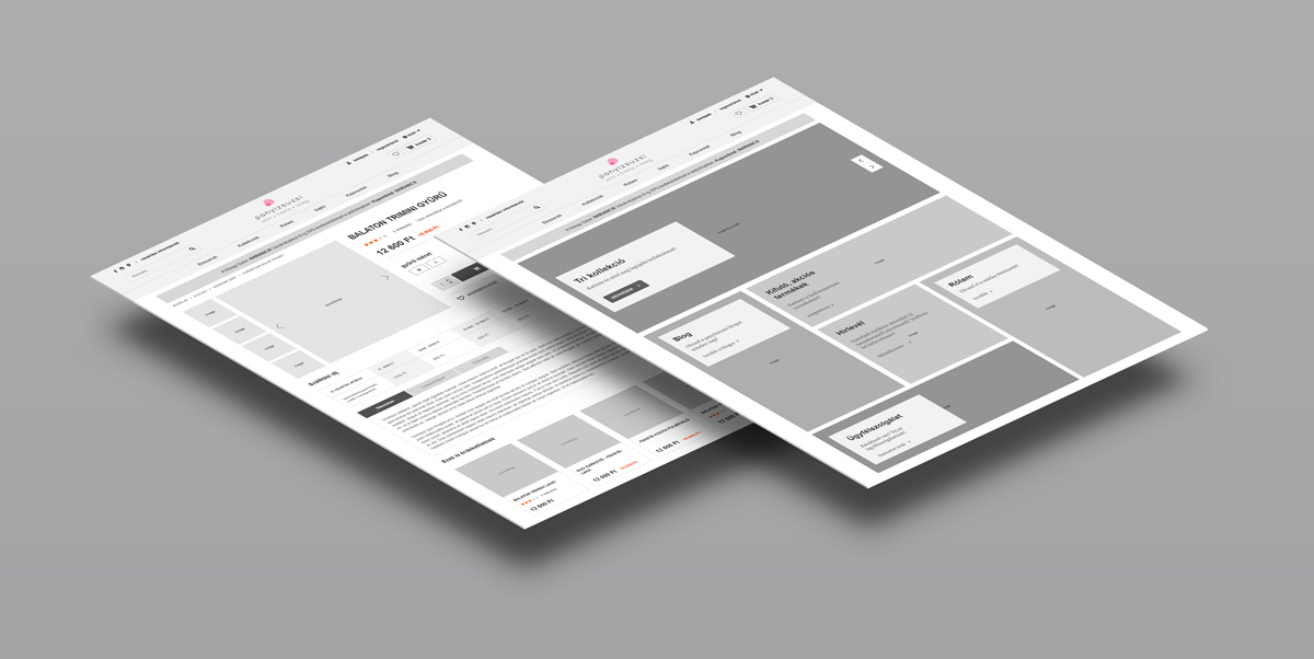
During the project’s preparation it was of great help that the client was already familiar with Magento’s operations as their previous webshop was already running on this system. Also having years of experience, they had their own ideas, considered functional requests and they were of great support with defying the objectives for the core of the planning process. As a result of having these precise requirements, setting the business goals for the project was smoother and quicker compared to other projects and we could start looking into the ergonomic planning sooner. During our workshops, we discussed the buildup of all layouts of the webshop: in other words, we modelled the pages with wireframes ahead of moving on to the exact design planning.
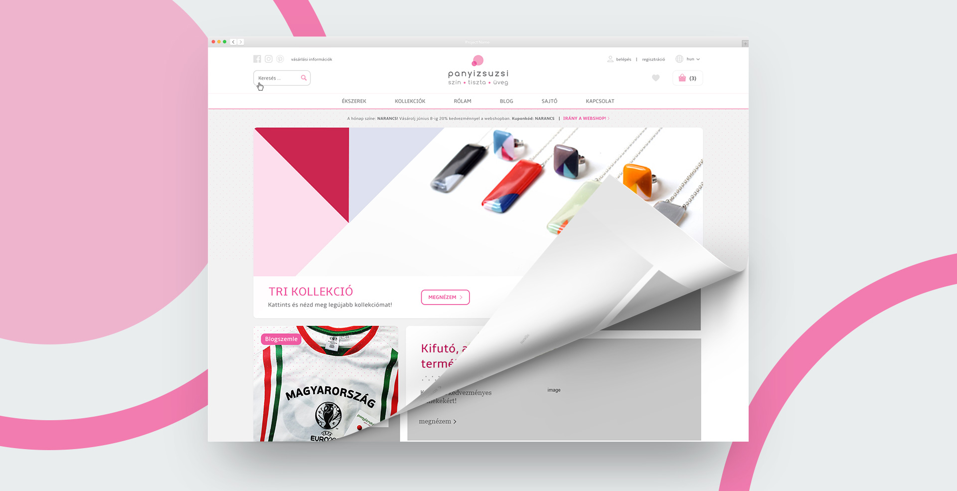
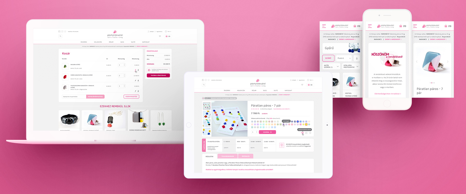
One of the focus areas of the planning was to find the right balance between the images and the product offerings. The Panyizsuzsi brand has a standard and seasonal collection offering and we wanted to make sure that the mood of these are showcased upon entering the site. To achieve this, we decided to use large-scale sliders and strong banners on the startpage as the first touchpoints that the visitors come across. We’ve highlighted the same content on the subpages as well (on category and product pages) for the customer to be able to understand certain product categories better and to be able to absorb them more.
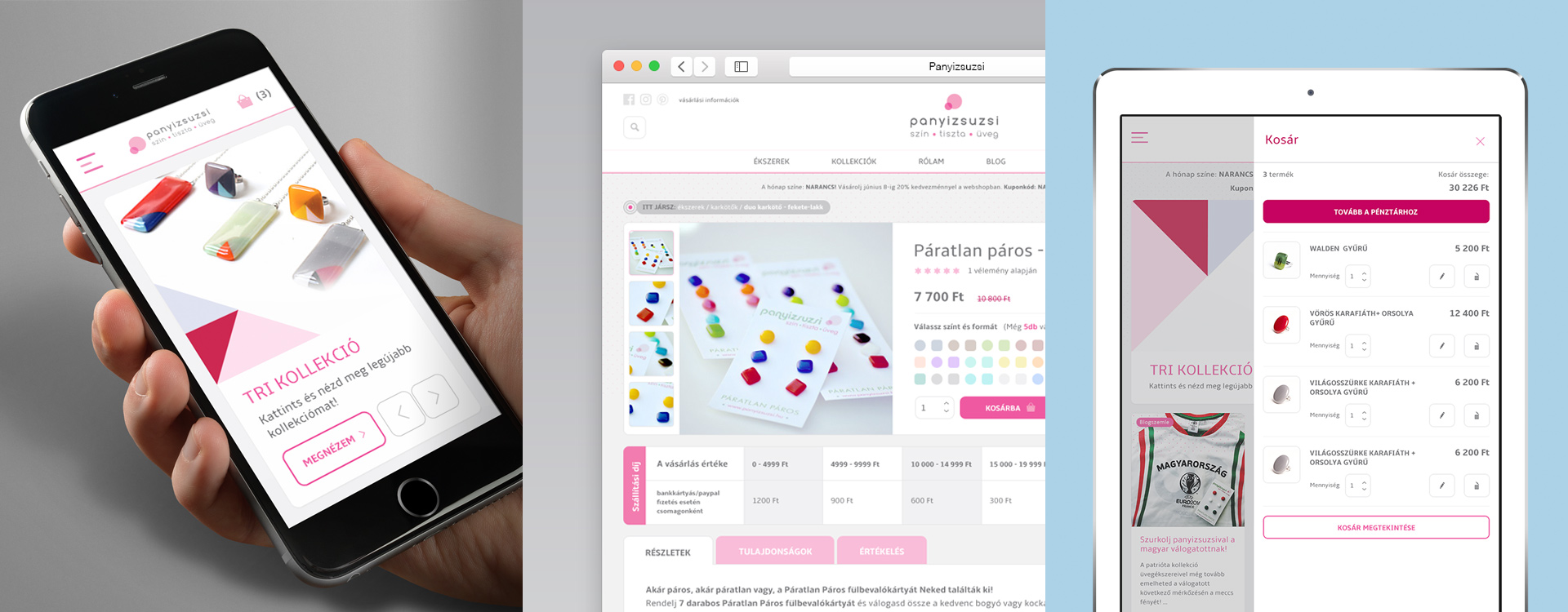
In the market that the brand positioned itself for, impulse purchases are a common trend, so with the UX planning we wanted to make sure that the shopping experience is as smooth as it could possibly be. Magento 2’s new checkout logics were coming in handy for this as it was a lot clearer and faster than the pervious version’s. The operation of Magento 2’s webshop engine is offering a very clear and straightforward process for the users on key pages such as the basket, the checkout, the account and the order confirmation pages.
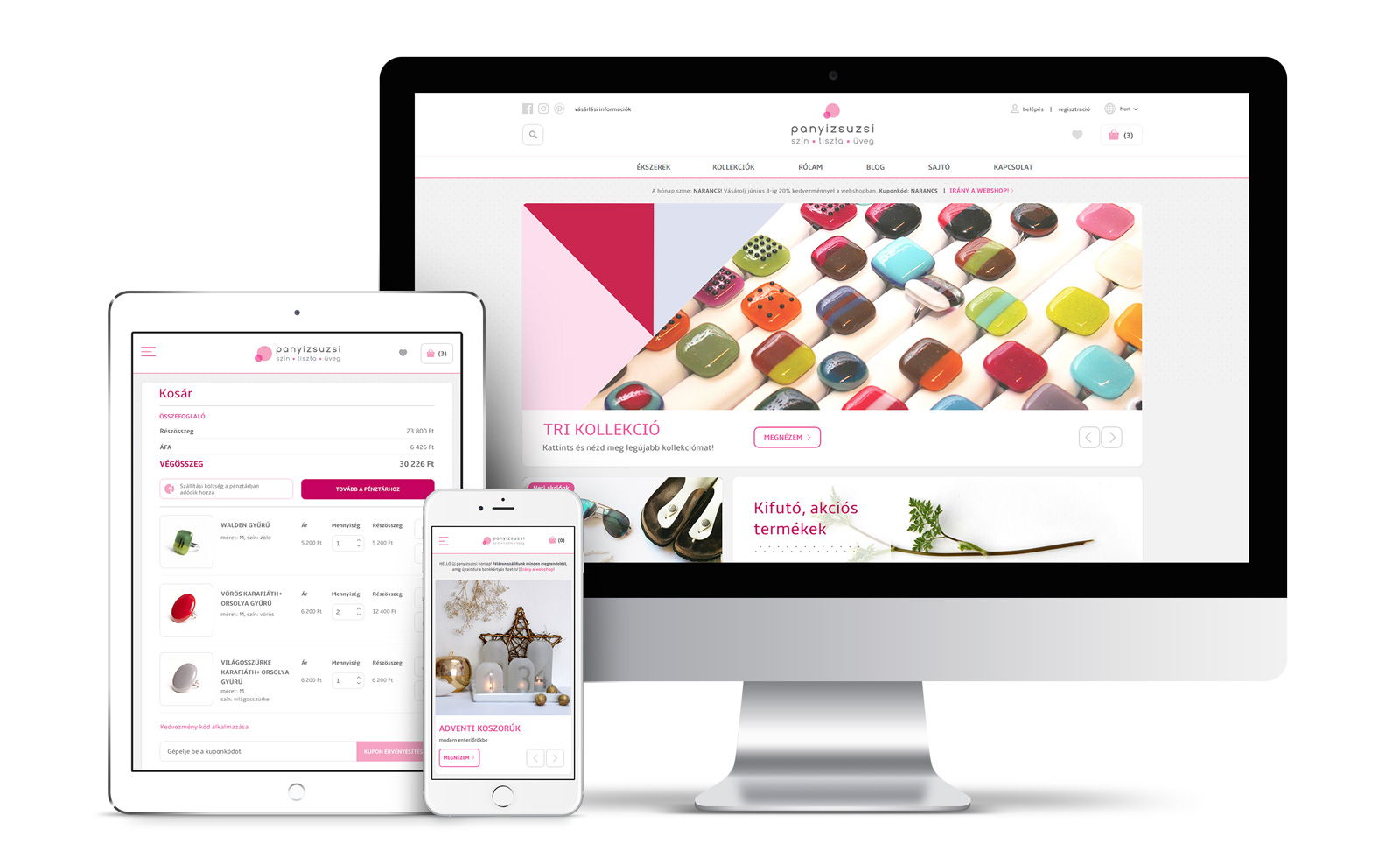
The site planning was also focusing heavily on responsiveness, a feature that the previous webshop was lacking and that needed updating. During the wireframe planning we’ve introduced a desktop version with a 1180-pixel width on top of the standard one. This version utilises the available space better on screens with a bigger resolution. The wireframe plans were designed with a 12-column grid view in mind. An advantage of such an arrangement is that changing between wider and narrower desktop views can be executed with minimal resources and it accommodates for creating breakpoints for tablet and mobile versions. The ergonomic plans were set for everything between the widest and the narrowest appearance options on a wireframe level, before we proceeded to even open Photoshop.
Identity and visual appearance
For lifestyle and fashion websites the shopping experience is as important as the products themselves. Panyizsuzsi jewellery is characterised by bold colours and playful geometric shapes where tonal harmonies create for a visually pleasing overall effect. There is a distinctive quality to her clean and refined pieces with a sense of effortlessness and richness in colour choices. With the webdesign we tried to channel this. For us to achieve this though, we had to examine the jewellery ourselves in careful and thorough way.

The UI components are generously rounded and spacious, and they make for the appearance of the friendly layouts referencing the minimalist feel of the product range. To ensure the consistency between the brand and the webdesign, the client was actively providing feedback throughout the planning process.
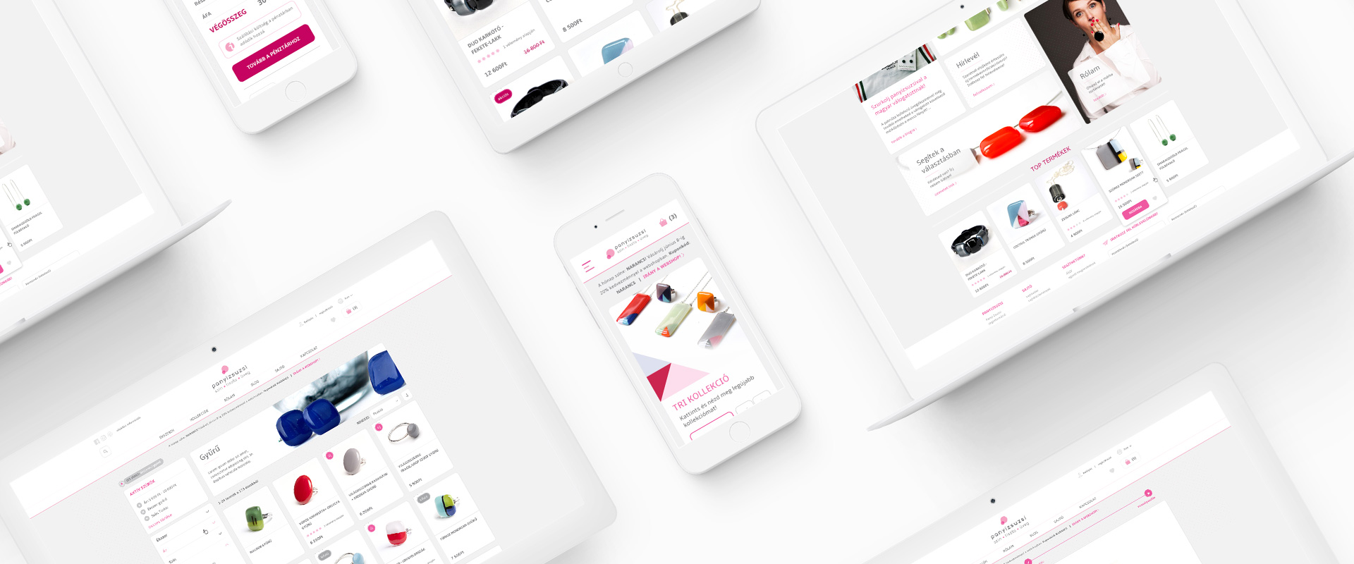
If you look closely, you will discover that the Panyizsuzsi products are in perfect harmony with each other: this is probably one of the reasons why the brand has built a fanbase of its own. They are made from the same materials, they build on the same shapes, but each item is different, creating a wide and carefully composed range. The creative combination of components makes for a wide selection of variations and uses. With the webdesign, we aimed to channel this as well: similar building blocks and their variations make for a new layout, mood and function on each site. For the design, we applied an atomic approach, meaning that we were working from smaller towards bigger. As a first step we created elementary components (UI kit) responding to the products’ style aesthetics. Afterwards came component types and finally the pages themselves.
The design planning also followed the rules and guidelines set out by Google’s material system. The main characteristics are defined by the grid layout, that complements the flat visual appearance with a subtle addition of depth. Certain UI elements have spatial extent meaning that they cast a shadow. The user only sees the products form a frontal view, the depth and the distance can only be estimated by these shadows. This solution channels the refined appearance of the flat design but it allows for more flexibility in expressing the hierarchy of the products as well as allowing certain elements to be slid over each other. It’s rule set offers great opportunities for playing around with hover effects by means of applying gentle size and shape changes.
When experimenting with typography, we opted for the Amble font type which has a softer appearance, compared to Arial, the font used for the previous version of the webshop. Vector graphics rendering is smoother with this font family in the user’s browser. Bold and light font settings are both available, setting a pleasant rhythm for the layout while offering a great way to highlight important headlines.
An interesting aspect of the Panyizsuzsi webshop is the appearance of barely noticeable but consistent presence of small animations. During the planning we were deliberately considering these micro interactions that are activated by the movement of the cursor. The user experience is enhanced by SVG animations, delicate zoom effects, slightly delayed size changes of the product cards, the changes of the input fields’ positioning and the opening and closing of drop-down panels with an easying effect.
Technology and development
The foundations of the development were laid by Magento’s latest version, published in 2016. This version of the webshop engine is essentially a brand-new platform. After years of development the manufacturer fully changed the backend architecture and the development solutions of the platform. By means of changing the code system to its core, a new Zend2 PHP framework was introduced alongside incremental indexing solutions and Magento 2 is now available in the latest, PHP7 environment. With such changes the speed of Magento increased by nearly 100%.

Magento 2, compared to the first series is more effective, it allows for more sophisticated caching, it has an improved search optimisation, it supports more sufficient import processes and it’s a more standardised and complex software in general. Magento 2 is updated with a new admin interface as well, where the user experience is enriched with touch-friendly components, configurational solutions that can be parameterised quicker, and information blocks that are grouped in a more logical way.
Besides the parameterisation and the frontend development of the panyizsuzsi.hu project, we’ve created unique Magento 2 modules, mainly focusing on integration, meaning that the whole platform was upgraded with client-specific technical content, reflecting on local market requirements. Such modules feature the OTP bank card payment system developed for Magento 2, as well as integration with DPD’s delivery system, that was created by us on a module-level. To manage the eDM campaigns of our client, we’ve integrated the webshop with the InterSpire e-mail marketer software, that times and synchronises the subscriber data of the two systems and matches them against each other thanks to our module development. Further developments also included integration with the system of Számlázz.hu that allows the client to generate automated invoices for orders, placed in the webshop. All these developments were made in accordance to Magento’s highest coding standards ever.
System implementation and support
Our team has a long-standing relationship with Panyi Zsuzsi. Each phase of the project – including the business go live and the following ‘babysitting’ phase – was done collaboratively, with a mutual focus on problem solving solutions. An intense, 3-month-long development period was followed by a thorough testing phase, in which we trialled and checked all functionalities on the site, together with the client. During these times, our team supported actively with content creation, starting from editing copy, to developing newsletters and HTML system messages all the way to building visual content.
The new webshop launched in November 2016, based on a carefully constructed go-live script. For this business, reliable and consistent IT support is crucial, so that the focus for them can remain on the creative and the design process of creating the jewellery, the production, the communication and the customer service. After the go-live date our team has been assisting with this, offering product support services as well.
Panyi Zsuzsi was one of the first ones to adapt Magento 2’s platform as a complex webshop in the local market. For us, it was a great pleasure to work with a local design enterprise with such an established identity and with such a clear business operation. If you’d like to delve into the world of minimal and playful hand-crafted jewellery, we’d recommend visiting her website.
