The Client
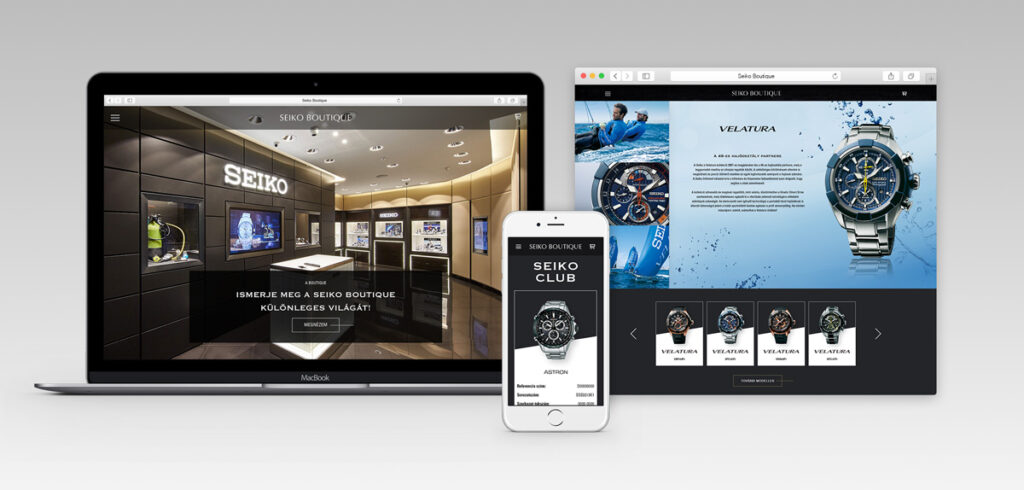
SEIKO is the pioneer of Japanese horology: it’s one of the most iconic brands in its field and many of its pieces were epoch-making designs in the past 130 years. The brand is entirely devoted to perfectionism with the highest quality standards in place and this shows not only in the manufacturing process but in the representation and the selling process as well. Our client, Seiko Boutique has opened its exquisite store that’s living up to the international expectations of the brand in 2016 – as the only premium reseller in the region – next to St. Stephan’s Basilica. It has been an honour when they appointed us to design their online appearance as well as a webshop that reflects the identity of the store and that is highly synchronised with the physical operations of it too. From the very beginning, it was of the essence to create a user experience for visitors online that offer the same, high levels of services that the store does. Their webshop, that launched in August 2016 was built on a Magento platform.
Ergonomic design
The challenge has been set at the earliest stages. We had to create a unique site that’s not only a webshop but a branding site as well both for SEIKO and their store. Building a brand image had to go hand in hand with sales and selling incentives on the very same platform. This called for new solutions as we had to steer away from standard e-commerce practices and conventions. Luckily enough, our client seemed to be a great support with an open mind and an innovative point of view. The ergonomic planning was centred around discovery, astonishment, a sense of ease when it came to delving deep into the technical details and last but not least, an effortless shopping experience. The existing product descriptions and the introductory materials on file came in handy, and the general idea behind the site’s concept proved to be of great help too. The founders of Seiko Boutique wanted to create a site that’s rich in content. A site on which news, blog posts, Seiko magazine features and special offers that are exclusively suited to premium club members all add value to the whole experience. This experience, in other words, was supported by an impressive amount of storytelling and rich content.
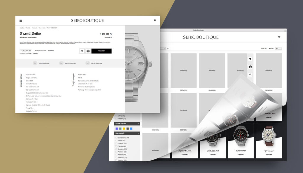
A few examples of wireframes from this project
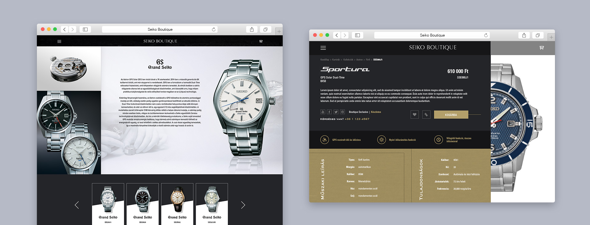
While creating the wireframes we moved away from the usual 1200-pixel desktop width towards the full width range on purpose. This way we could allow more space for the outstanding visual appearance of both the brand and the products. The same time, we extended the space ‘downwards’ as well: we used fix-frame-sized blocks to create a lookbook-like experience. We kept paring the sites back, constantly refining them while creating obvious focal points for the users. The site is characterised by strong visual impulses, airy spaces, dominant typographical features and mood-creating content banners, that take over the screen. The design planning was preceded by an extensive wireframe planning, covering all the important topics as well as product workshops. This is how we managed to create collection pages, unusual but informative product pages and specific, experience-rich sections for VIP users. All these were created first as ergonomic concepts, way before we even attempted creating them in Photoshop.
Identity and visual appearance
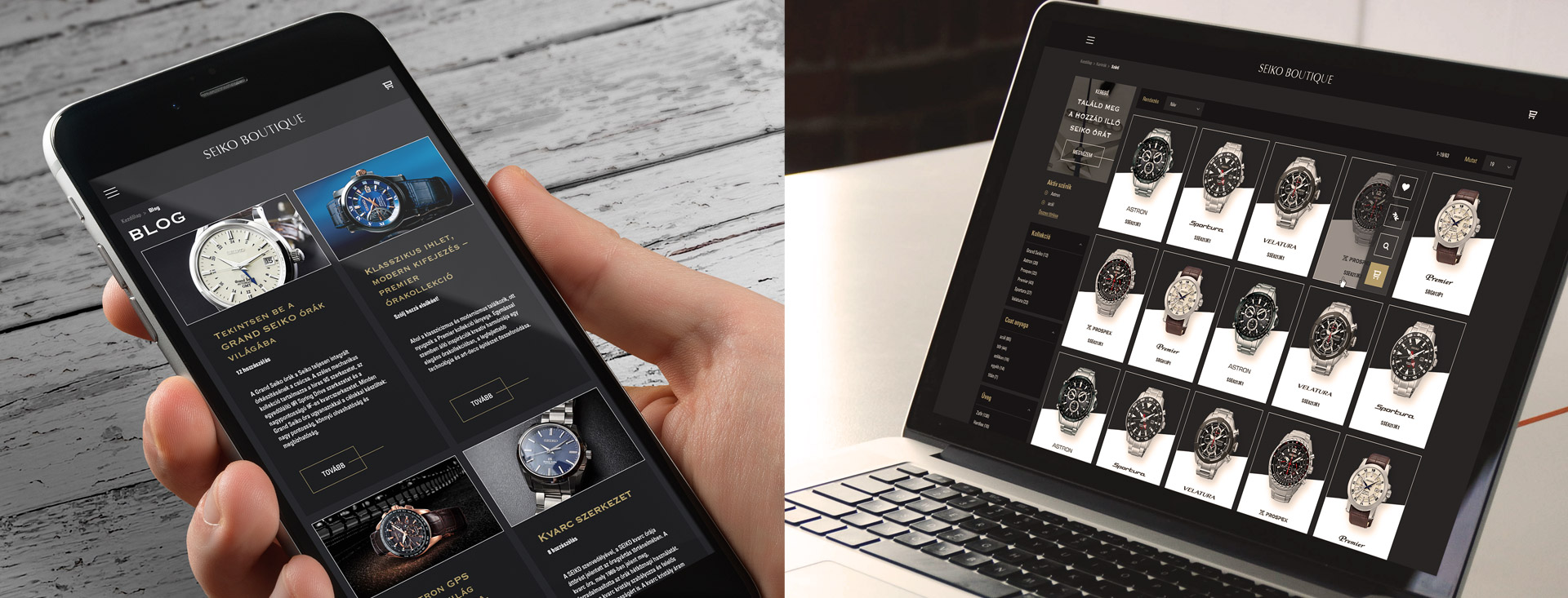
The design planning of this project was pure bliss for our team. Working with the brand’s own identity, with its images, visuals and product packshots was a rewarding task. The planning process involved many of our experts from our design and frontend teams and we were constantly interacting and brainstorming together with our client as well. We’ve agreed that it was highly important to convey an elevated lifestyle, that was meant to target male customers of a higher social and economic status. The high-quality images allowed us to work with parallax elements and exciting animations. An exciting aspect of the design planning process was to work with Seiko’s product collections, that sometimes have their own logos, colour-harmonies and mini identities. These had to be aligned and blended in a way that they didn’t clash with each other or with the overall appearance of the site. To achieve this, we mirrored the dark grey and golden-brown aesthetics of the physical store space, that offered a great alternative for this fusion.
After finalising the designs of the main pages, we developed them straight away so that they could be presented at the brand’s headquarters in Tokyo. This was a must as the online representation of the product range has to live up to the international standards, set by the brand itself. This meant that in the design phase we’ve already been creating frontend prototypes, ahead of starting the Magento developments. After receiving feedback from the identity responsibles of the brand, we carried on with the design planning, creating all the responsive layouts and we’ve also developed a UI kit and a CSS style guide.
Development and launch
We’ve used Magento as a starting point for the technological development as it has a cutting edge content management and e-commerce functionality offering. To enhance the customer experience further, we’ve utilised a lot of existing OANDER Magento modules that we’ve created previously. As SEIKO’s product offering is very broad and as it covers a rich set of technical specifications, we’ve developed a special search engine and a wizard for the website. These were based on a next-next-finish principle: with the help of this solution we could offer products that match the technical requirements and style aesthetics of the customers. For the same reasons, we were focusing on the product comparing functionalities and we’ve created a product recommendation engine as well, that suggests similar products to customers with the help of pre-programmed algorithms.
Another challenge of the development project was the creation of a tiered club membership system. With the help of this, customers can register the pieces they have previously purchased and in return, Seiko Boutique can target them with special promotions, and they can publish offers and information that is not available to anyone else but the client. This club membership programme is also a tool for the brand to keep in touch with their customers and it’s a tool for strengthening brand loyalty: customers can have access to exclusive events, special services and additional information as well. All these functionalities have been developed specifically for this project with the help of the Magento engine.
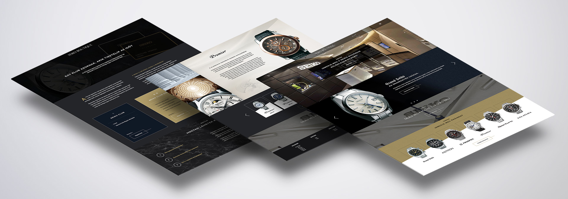
We can proudly and confidentially say that the Seiko Boutique project has been the most complex Magento frontend development that has been carried out so far. Some interfaces on the site go against the standard Magento ergonomic logics and the webshop is equipped with multiple modules that required unique sitebuild solutions – this made the frontend development of Seiko Boutique a real challenge. A challenge that was very exciting for us. As for the client-facing developments, we’ve used a Bootstrap-based Magento template as a starting point. This made the project more cost-effective and it ensured higher code quality than using one of Magento’s default templates.
The development was followed by a very thorough test period. Afterwards our team actively supported the content development of the site. This way we supported our client by editing content, we’ve prepared editing guidelines and our design team provided help with creating different visuals and banners for the site. The ecommerce platform of Seiko Boutique went live in July 2016. As part of a close collaboration with the client we managed to create a site that lives up to the expectations of the brand and to their prestigious stores as well. Those who are interested in watches and horology should visit their site and explore more.
